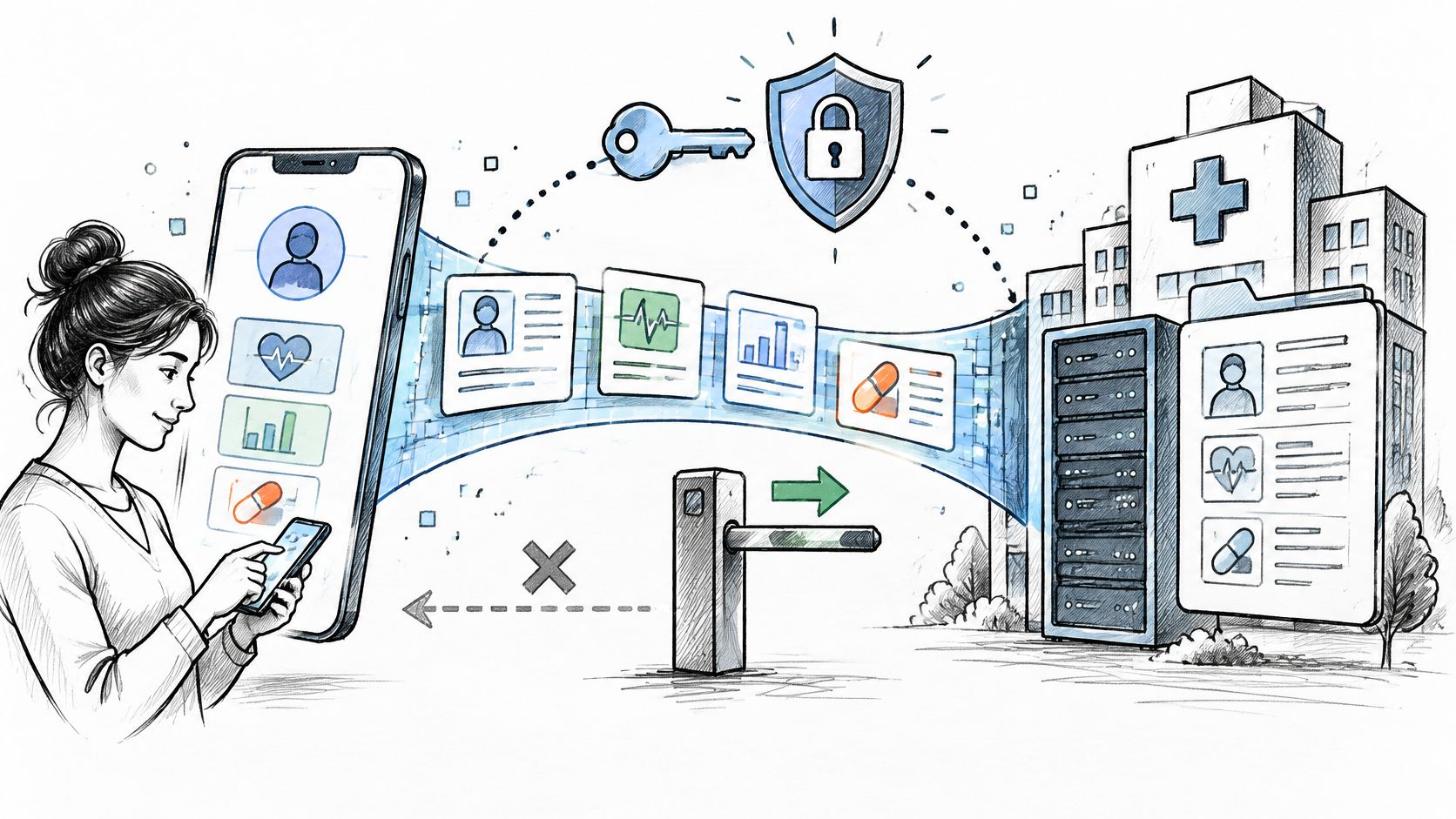
Clinicians can look fully booked and still leave leaders with slow access, rising overtime, and dashboard arguments that never seem to end. One team says volume is up. Another says the panel is too complex. Finance sees labor creep, while operations sees missed capacity. That's the exact place where care team productivity analytics earns its keep, not by measuring who looks busy, but by showing whether the team is turning time, staffing, and coordination work into patient-facing value.
The hard part is that care teams aren't factories. A visit, a referral, a chart review, and a follow-up call all sit inside the same workflow, but they don't contribute in the same way. A mature analytics model has to separate value-adding coordination from waste, then compare teams across roles and settings without punishing the people who carry harder panels or more complex work. That's why the strongest operating model is usually team-based, not individual.
For healthtech product and operations leaders, this creates a design problem as much as a reporting problem. The right answer usually sits at the intersection of workflow, staffing, and data architecture, which is why many teams look for a healthtech engineering partner or broader Healthcare AI Services support when they need a system that can connect operational data to decision-making. The point isn't to add another dashboard, it's to create a trusted way to see where capacity is leaking and what to fix first.
A useful baseline for interprofessional work is also described in the interprofessional care coordination guide from Premiere Education, especially if your team needs a practical lens on collaboration before you start measuring it. The most useful analytics programs make that collaboration visible instead of assuming it.
Introduction Why Care Team Productivity Is Hard to Measure
A care team can be overloaded on paper and underperforming in practice. That mismatch is common because leaders often track the easiest thing to count, visits, messages, tasks closed, or hours scheduled, and then assume the number tells the full story. It usually doesn't. Healthcare productivity is more useful when it's treated as outputs divided by inputs, with quality included in the output set, not just raw volume, as highlighted in a 2025 bibliometric review of healthcare productivity research (PubMed review).
Why busy dashboards still miss the point
A team can close lots of work and still create poor access if the underlying flow is clogged. That's why output-only reporting can mislead operations leaders. The newer research described in the same review shows a shift toward multi-factor efficiency models, especially Data Envelopment Analysis and the Malmquist Index, which compare staffing, equipment, and financial inputs against services delivered while treating quality as part of the output set (PubMed review).
Practical rule: if a metric doesn't show both the work completed and the resources consumed, it's probably a partial view, not a productivity view.
The business stakes are straightforward. If leaders can't see how capacity is flowing through the team, they'll overreact to headcount, underreact to workflow waste, and struggle to explain why access, labor cost, and patient experience move in different directions. That's why modern workforce dashboards, whether in hospitals, ambulatory care, or care management programs, focus on team efficiency per unit of labor rather than “busyness” alone.
What mature analytics unlocks
The best analytics programs don't just show activity. They help teams answer questions like which workflow is slowing the panel, where administrative drag is eating clinician time, and whether staffing is aligned with demand. For operations leaders, that means moving from “How many tasks did we complete?” to “How much patient-facing value did we create per FTE, and what got in the way?” That shift is the difference between reporting and management.
What Care Team Productivity Analytics Really Means
At the simplest level, care team productivity analytics asks one question, how efficiently does a team turn inputs into useful healthcare output? The classic formula is clean, outputs divided by inputs. In healthcare, though, the trick is deciding what counts as output and what belongs in the denominator. A factory line can count units. A care team has to count visits, coordination, and quality together.

From volume to value
The more useful framing is efficiency in converting resources into healthcare services. That definition is now common in the research base, and it's the reason simple throughput counts don't go far enough (PubMed review). If a team sees more patients but quality falls, productivity hasn't really improved. It has just shifted the burden elsewhere.
That's also why ratios such as output per full-time equivalent show up so often. They let leaders compare teams using a common labor denominator, even when one site has more support staff, more complex case mix, or different visit patterns. The point isn't to reduce care to a single number. The point is to make the trade-off between labor and value visible.
Healthcare productivity is commonly defined as how efficiently resources such as staff, equipment, and finances are converted into healthcare services, while modern measurement adds quality to the output side.
Why frontier methods matter
A second concept matters for leaders who want a more rigorous benchmark. The field has moved from simple counts toward multi-factor efficiency models such as Data Envelopment Analysis and the Malmquist Index (PubMed review). Those approaches don't ask whether one team is merely busier than another. They ask whether a team is operating near the best observed frontier, given its inputs.
That distinction is important because busy-ness can be deceptive. A team can be working harder because its workflow is messy, not because it's performing better. In practice, care team productivity analytics is about separating productive effort from avoidable drag, then deciding what to redesign first.
If you need a plain-language resource for clinicians who ask how to stay efficient while managing training or certification demands, the staying productive while certifying article from ProMed Certifications is a useful companion read. It fits well when you're translating analytics into day-to-day work habits.
Key KPIs and Data Sources That Actually Matter
The wrong KPI creates false confidence. The right one changes how leaders staff, schedule, and support the team. Care team productivity analytics works best when the measures are grouped by the decision they support, instead of squeezed into one blended score.
Pick metrics by the decision you want to make
Input metrics show what you spend. Output metrics show what the team produced. Efficiency metrics connect the two. Quality and engagement metrics show whether the work was useful and whether the care process moved fast enough to matter.
That structure also matches how broader workforce analytics are typically tracked, including worked hours versus scheduled hours, overtime, premium pay, skill mix, FTE composition, float-pool usage, indirect time, revenue per staff member, and turnover rate (symplr workforce metrics).
For inpatient and nursing environments, labor measurement often uses models like WHPUOS, which compares worked hours to units of service, and target hours based on census multiplied by budgeted hours per patient day (PMC article). In care management and ambulatory settings, the better question may be cycle time, no-show rate, clean-claim rate, or charge lag, because those measures show whether the team's workflow is turning effort into access and revenue realization.
Choosing the right productivity KPI by goal
| Business Goal |
Primary KPI |
Supporting Metrics |
Common Pitfall |
| Control labor cost |
Worked hours versus scheduled hours |
Overtime, premium pay, float-pool use |
Treating all hours as equal when indirect time is rising |
| Improve staffing efficiency |
WHPUOS or output per FTE |
Skill mix, census, HPPD-based targets |
Ignoring case mix and unit complexity |
| Speed up access |
Cycle time |
No-show rate, engagement velocity, appointment lag |
Fixating on volume while delays stay the same |
| Improve revenue realization |
wRVUs per encounter or revenue per staff member |
Clean-claim rate, charge lag |
Collapsing billing problems into a staffing issue |
| Track care coordination quality |
Engagement and follow-up completion |
Process adherence, result follow-up, referral closure |
Counting contact attempts instead of successful resolution |
The next step is data quality. A KPI only helps if the underlying feed is trustworthy. EHR, HRIS, scheduling, billing, and care-management platforms often need help with extraction, normalization, and role mapping before the numbers can be compared across teams.
That is where our AI-powered data extraction engine fits into the workflow. It is useful when it is tied to a clear data model, not used as a generic automation layer.
The implementation mistake to avoid is building one “productivity score” before the organization agrees on the decision it is meant to support.
Rule of thumb: if finance, clinical leadership, and operations each need a different action from the dashboard, do not force them into the same KPI.
Architecture and EHR Integration Considerations
A care team dashboard can look precise on screen and still fail in practice if the source systems disagree on who did what, when, and under which role. That is why architecture matters as much as the KPI definition. The goal is not just to collect data, but to turn scattered operational events into a shared view of team efficiency, including the administrative load that often hides inside “productivity.”

From source systems to semantic meaning
A practical stack usually moves from EHR, HRIS, scheduling, billing, and care-management systems into ingestion, identity resolution, normalization, an analytics warehouse, and then a semantic layer. That last layer does the translation work. The warehouse stores the records, but the semantic layer decides what “team,” “encounter,” and “productivity” mean for the organization.
EHR integration can use FHIR APIs, HL7v2 feeds, or bulk exports, and each path comes with trade-offs in latency and completeness. Bulk exports are often enough for retrospective reporting, but they can be too slow for near real-time staffing decisions. APIs can move faster, yet they still produce inconsistent views if master data for roles, panels, and attribution is not clean.
Build-versus-buy is really a workflow question
Many organizations stall here because they start with software instead of operating design. A custom build may fit when role-specific attribution, complex panel logic, or cross-site normalization are hard to express in off-the-shelf tools. A managed platform may fit when speed and standardization matter more, provided it fits the data governance rules.
If you are mapping that path, the AI Product Development Workflow helps teams structure discovery, integration, and deployment without skipping the operational design work. In some programs, that planning phase is also when custom healthcare software development partners, like Bridge Global healthcare engineering, are evaluated for the data plumbing side, while compliance review is handled separately by a regulatory compliance partner.
The main trade-off is latency versus confidence. Real-time visibility helps only when attribution is trustworthy. Otherwise, managers end up chasing false variance and lose confidence in the dashboard.
Analytics Methods From Descriptive to Predictive
A care team can have decent staffing on paper and still feel overloaded because the work is spread across coordination, documentation, follow-up, and direct care. The analytics method should match the question. Some teams first need a clean read on where time goes, others need to understand why capacity keeps slipping, and a few are ready to estimate where risk will show up next.
What each lens is for
Descriptive analytics answers what happened. It usually starts with trends, comparisons, and variance against budget or target, which helps when leaders are still arguing about the baseline. Diagnostic analytics asks why it happened, using root-cause review and peer comparison to separate expected variation from avoidable waste. Predictive analytics looks ahead, estimating staffing risk or demand shifts so managers can plan earlier.
The order matters. If the current numbers are not trusted, forecasts only speed up disagreement. In care operations, prediction should support judgment, not replace it.
Benchmarking against a frontier
For interprofessional teams, Data Envelopment Analysis and stochastic frontier analysis are the main model families in the evidence base. A VA review found 76% of 25 included studies used DEA, most of the rest used stochastic frontier analysis, and staffing was the most common input in 84% of the model-based studies (VA evidence review). That points to an important idea. Team productivity is better treated as a multi-input efficiency frontier than as a simple output tally.
That frontier view helps separate value-adding coordination from administrative drag. Two teams may see the same visit count, yet one carries more handoffs, inbox work, or panel complexity to get there. The model should reflect that difference instead of pretending all output is interchangeable.
Inputs need careful definition. Common choices include clinician FTEs, care coordination time, and support staff capacity. The benchmarking question becomes, which peer team is producing more with a similar input mix, and where is this team carrying slack?
Benchmarking works only when like is compared with like. If one panel is more complex, the model needs role, acuity, or setting adjustments, or the score turns into a penalty instead of a planning tool.
For teams considering a vendor-supported analytics layer, AI strategy consulting can help shape the operating model, and a Custom AI Strategy report can document the assumptions behind the metrics. Those tools still depend on a clear productivity definition. Without that, analytics can make a vague measure look precise.
Dashboards and Data Visualization That Drive Action
A productivity dashboard is useful only if someone can act on it in under a minute. Operations leads need variance, product managers need workflow signal, and clinical leads need enough context to trust the number without opening ten tabs. The goal is not more charts. The goal is faster decisions.
Design for the person who will use it
An operations lead usually cares about capacity versus demand, overtime, and whether worked hours are drifting from target. A clinical lead cares more about team scorecards, quality context, and whether the panel is being handled safely. A product manager needs adoption and workflow efficiency trends, because a poor feature rollout can create administrative burden even when the workflow looks efficient on paper.
That's why the dashboard should move from enterprise, to site, to team, to workstream. A good default view might show WHPUOS versus target at the top, then variance by unit or team, then a drill-down into the drivers, such as schedule gaps or documentation bottlenecks. Real-time productivity reporting is especially valuable because it surfaces understaffing and overstaffing patterns early enough for managers to adjust schedules before inefficiencies compound (Strata operational analytics).
Keep the visuals short and decision-shaped
One practical pattern is to pair a summary tile with a drill-down table. Another is to show a trend line next to a budget variance band, so the user can tell whether the team is off plan because demand changed or because the workflow slipped. Short views win. Vanity metrics don't.
If you're wiring those dashboards into daily operations, internal tooling and AI Automation as a Service can reduce repetitive reporting steps, while AI requirements analysis keeps the dashboard tied to a real operational decision. For teams building around a narrow use case first, real-world use cases can help the product group avoid overbuilding.
Privacy Compliance and Data Governance Essentials
A dashboard that clinicians do not trust will not last. Privacy and governance have to come first, because productivity analytics can feel like surveillance if the rules are unclear. Once that concern shows up, even a technically accurate metric gets ignored.
Make the metric explainable before you make it visible
Start with role-based access, audit trails, and definitions that everyone can read the same way. That means being clear about how staff, panels, and time are assigned, so a team-level view does not turn into a messy argument about who counted what. For cross-team benchmarking, de-identification is usually the safer choice, especially when the goal is to compare patterns rather than review individual behavior.
The same logic applies to hidden administrative load. If clinicians are spending time on documentation, referrals, insurance, or results follow-up, the analytics layer should show where that work sits without turning it into a blame exercise. Admin work is often the part of productivity that sits outside the visible workflow, like weight in a backpack that slows the whole team even when the route looks clear.
A Canadian synthesis reported that physicians and residents spend 10 hours per week on admin work, with about half described as unnecessary, and that burden has remained unchanged since 2021 in one survey synthesis; a separate 2025 physician study found administrative responsibilities directly reduce time for patient care (McMaster Forum report). That is the hidden load many dashboards miss.
Governance protects adoption
Transparent metric definitions matter as much as encryption. If clinicians do not know how a score is calculated, they will assume it is unfair. If leaders cannot audit the data lineage, they will hesitate to use the output for staffing decisions.
Good governance also makes it easier to work with a regulatory compliance partner when privacy reviews, cross-border data handling, or policy constraints enter the picture. For teams designing pipelines for AI compliance, privacy works best when it is built into product design and daily analytics delivery, not saved for a final review step.
Implementation Roadmap Change Management and ROI in Practice
A rollout fails fastest when teams try to measure everything at once. Start with one care model, confirm the data is trustworthy, then expand after people see the numbers reflect real work. Discovery, AI requirements analysis support, and a narrow pilot help set that foundation.
A practical plan usually begins with one workflow, one site, and one executive owner. From there, the team checks role-based normalization, teaches managers how to read the dashboard, and uses early findings to redesign work, not to ask staff to move faster. A focused implementation support workflow helps move the program from concept to delivery while keeping it aligned with operations.
ROI rarely appears as a single number. It shows up in fewer overtime spikes, better access, and cleaner revenue realization, while care-management KPIs show whether coordination quality is improving or just shifting work around.
The comparison matters. A team that looks slower on raw throughput may be operating closer to its efficiency frontier if it is carrying more administrative load or coordinating a more complex care mix. That is why benchmarks need context. Comparing two care models without normalizing for role mix and workflow burden can make a solid team look weak.
If you need help turning those outcomes into a plan, a Custom AI Strategy report can align the metrics, rollout phases, and ownership model before implementation begins. If you're ready to compare your current model against a team-level efficiency frontier, our expert team can help you map the data, the workflow, and the governance behind it.